- Nederlands, Belgique / België
- Česky, Česká republika
- Deutsch, Deutschland
- Español, España
- English, Europe
- Français, France
- Italiano, Italia
- Magyar, Magyarország
- Nederlands, Nederland
- Deutsch, Österreich
- Polski, Polska
- Română, România
- Français / Deutsch, Suisse / Schweiz
- Svenska, Sverige
- Suomeksi, Suomi
- Türkçe, Türkiye
- English, United Kingdom
- Slovenská, Slovak
- Español, Mexico

- All Product Highlights
- Measurlink 10
- HR-600 Series
- TAGLENS
- MCOSMOS 5
- Crysta Apex V
- Formtracer Avant
- MiSTAR 555
- Calipers
- Bluetooth Data Transmission
- PJ Plus
- QuickVision Pro
- All Products by Industry
- Aerospace
- Medical
- Automotive
- Energy
- Gen. Manufacturing
- Electronics
- Original Equipment Manufacturers (OEM)
- Case Studies
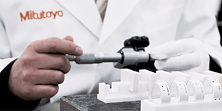
- All Small Tools
- Calipers
- Micrometers & Micrometer heads
- Inside Measuring Instruments
- Depth Measuring Instruments
- Height Gauges
- Indicators & Caliper Gauges
- Auxiliary Equipment and Miscellaneous
- Calibration Instruments
- Gauge Blocks
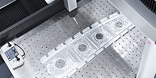
- All CMM
- Small & Medium sized CMMs
- In-line & Shopfloor CMMs
- Large sized CMMs
- CMM Rotary Tables
- Probes
- Styli
- Fixtures
- Enclosures
- CMM Software
- All Vision
- Manual 2D Vision Systems
- Manual 3D Vision Systems
- 3D CNC Vision Systems
- 3D CNC Multi-sensor Vision Systems
- MiSCAN Vision Systems
- 3D CNC Micro Geometry Vision Systems
- Vision System Software
- Vision System Accessories
- All Optical
- Magnifiers
- Measuring Projectors
- Measuring Microscopes
- Microscope Units
- Objective Lenses
- M2 for Measuring Microscopes and Projectors
- TAGLENS
- Illumination Units
- All Hardness
- Portable Hardness Testers
- Combination Testers
- Vickers Testers
- Automatic Vickers Testers
- Micro-Vickers Testers
- Hardness Testing Software
- Reference materials and indenters
- All Sensors
- Linear Gauges
- Low Force Gauges
- Counters and Display Units
- Laser Scan Micrometers
- Surface Measure
- Sensor Management Software
- Micrometers & Micrometer heads
- Digital & Mechanical Micrometers
- Micrometer Accessories
- Micrometer Heads
- Micrometer Head Accessories
- Inside Measuring Instruments
- Inside Micrometers
- Bore Gauges
- Inside Micrometer & Bore Gauge Accessories
- Indicators & Caliper Gauges
- Digital Indicators
- Indicator Accessories
- Lever Indicators
- Dial Indicators
- Dial Test Indicators Accessories
- Thickness, Caliper & Tension Gauges
- Auxiliary Equipment and Miscellaneous
- Indicator Satnds
- Precision Vices
- Plates and Granite Squares
- Angle Measurement and Squares
- Feeler Gauges, Rules, Knife Edges
- Gauge Blocks
- Steel Gauge Block Sets
- Steel Individual Gauge Blocks
- Ceramic Gauge Block Sets
- Ceramic Individual Gauge Blocks
- Special Gauge Blocks
- Gauge Block Accessories
- Small & Medium sized CMMs
- CRYSTA-Apex V - 500, 700, & 900 Series
- CRYSTA-Apex V - 1200, 1600 & 2000 Series
- CRYSTA-Apex EX Series for REVO
- STRATO-Active Series
- STRATO-Apex - 500, 700, & 900 Series
- STRATO-Apex - 1600 Series
- LEGEX Series
- Styli
- Styli Kits
- Straight Styli
- Diamond Coated Styli
- Master Ball
- Machine Tool Styli
- Star Styli
- Styli for Star Styli
- Cylinder Styli
- Disk Styli
- Tip Styli
- Extensions
- Holders
- Adapters
- Joints
- Screws for Cubes
- Tools
- StyliCleaner
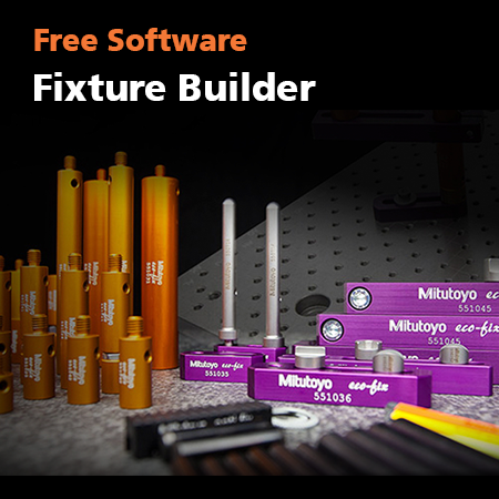
- Fixtures
- Fixturing Kits
- Base Plates
- Build-up Components
- Positioning & Stopper Components
- Profile Components
- Base Components
- Clamping Components
- Adapters
- Slider Components
- Racks
- 3D CNC Vision Systems
- Quick Vision ACTIVE
- Quick Vision APEX / HYPER
- Quick Vision ACCEL
- Quick Vision ULTRA
- Measuring Projectors
- PJ Series
- PV Series
- PH Series
- Data Processing Unit
- Edge Detection Sensor
- Accessories
- Measuring Microscopes
- TM Series Gen. B
- MF Series Gen. D
- MF-U Series Gen. D
- Illumination Sources
- Vision Unit
- QSPAK-VUE Software
- Objective Lenses
- ML-Series Objectives
- Brightfield Observation Objectives
- Brightfield/Darkfield Observation Objectives
- NIR Objectives
- NIR LCD Objectives
- NUV Objectives
- NUV LCD Objectives
- UV Objectives
- UV LCD Objectives
- Surface Roughness
- Surftest SJ-210
- Surftest SJ-310
- Surftest SJ-410
- Surftest SJ-500
- Surftest SV-2100
- Surftest SJ-500P
- Surftest SV-2100P
- Formtracer Avant FTA-S3000
- Surftest Extreme SV-3000CNC
- Surftest Extreme SV-M3000CNC
- Surface Roughness & Contour
- Formtracer Avant FTA-D3000 / FTA-D4000 Series
- Formtracer CS-3300
- Formtracer Extreme SV-C4500CNC
- Formtracer Extreme SV-C4500CNC HYBRID Type 1
- Formtracer Extreme CS-5000CNC and CS-H5000CNC
- Portable Hardness Testers
- Impact Type Hardness Testing Unit HARDMATIC HH-411
- Digital and Analogue Durometers HARDMATIC HH-300
- Combination Testers
- Rockwell HR-200/300/400
- Rockwell, Rockwell Superficial, Brinell Hardness Tester HR-530 and HR-600
- Rockwell Automatic Hardness Testing HR-600
- Automatic Vickers Testers
- Automatic Micro-Vickers hardness testing systems
- Automatic Vickers hardness testing systems
- Reference materials and indenters
- Hardness reference materials
- Hardness indenters and replacement balls
- Linear Gauges
- ABSOLUTE Digimatic Linear Gauge LGS Series
- Air Drive Unit
- Linear Gauge LG100 Series
- Linear Gauge LG200 Series
- Laser Hologauge
- Counters and Display Units
- EJ Counter and Interfaces for Linear Gauges
- EC Counter for Linear Gauges
- EG Counter for Linear Gauges
- EH Counter for Linear Gauges
- EV Counter for Linear Gauges
- Display Unit for EV Counter
- Laser Scan Micrometers
- Laser Scan Micrometer Measuring Unit
- Laser Scan Micrometer Controller Unit
- Laser Scan Micrometer Interface Unit
- Laser Scan Micrometer Optional Accessories
- DRO Linear Scales and Counters
- DRO Linear Scales AT103
- DRO Linear Scales AT103 - High Accuracy
- DRO Linear Scales AT113
- DRO Linear Scales AT113 - High Accuracy
- DRO ABS Linear Scales AT715
- Universal DRO KA-200 Counter
- NC Linear Scales
- NC Linear Scales ST36
- NC Linear Scales ST46-EZA
- NC Linear Scales ABS ST700
- NC Linear Scales ABS ST1300
- NC Linear Scales AT211
- NC Linear Scales ABS AT1100
- NC Linear Scales ABS AT1300
- Scale Units
- Horizontal ABSOLUTE Scale Coolant Proof IP66
- Horizontal ABSOLUTE Scale Standard
- Horizontal ABSOLUTE Scale Measurement Direction Switching
- Horizontal ABSOLUTE Scale Diameter Function
- Vertical ABSOLUTE Scale Standard
- Vertical ABSOLUTE Scale Measurement Direction Switching
- Vertical ABSOLUTE Scale Diameter Function
- Signal Cables
- USB Input Tool Direct (Digimatic-USB Cable)
- Digimatic Data Cables
- Digimatic Extension Cables
- Wireless Communication
- Wireless Communication System U-WAVE
- U-WAVE Bluetooth
- U-WAVE-T Connection Cables and Connection Units
- Interfaces
- USB Input Tool
- DMT-3T / FS2 USB
- DMX-1 USB
- DMX-2 S
- DMX-2 USB
- DMX-3 USB
- MUX-10F
- DMX-8/2
- DMX-16 / DMX-16C
- DMX-0-1 USB / DMX-3-2 USB
- Digimatic Interface MIG
 Aerospace
Complex aerospace applications need fast, extremely precise quality control to ensure accurate assemblies. See how Mitutoyo makes it happen
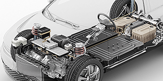 Automotive
The automotive industry continues to innovate, and Mitutoyo delivers the advanced inspection and scanning capabilities to help manufacturers achieve ongoing production
 Energy
Mitutoyo’s measurement and analysis solutions are designed to help energy providers improve reliability and increase equipment uptime.
 Medical
To protect patient well-being, medical applications require exceptional accuracy. See how extensively tested solutions from Mitutoyo can help you achieve it.
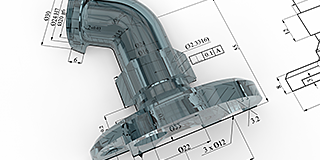 Gen. Manufacturing
Ensure high repeatability and rigorous quality control with form measurement solutions, coordinate measuring machines and precision measuring tools from Mitutoyo.
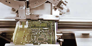 Electronics
The non-contact and vision measurement solutions from Mitutoyo bring microscopic accuracy to smaller and denser electronic components
 Original Equipment Manufacturers (OEM)
Mitutoyo OEM can address missing expertise or resources by supplying you with our renowned Metrology equipment that seamlessly integrates into your products.
 Case Studies
For an overview of Mitutoyo's capabilities, this is no greater place to look than our marvelous collection of case studies.
 Mitutoyo Japan Desk
The first stop for Japanese companies operating in Europe

 Custom Products
Custom-made products for unique applications
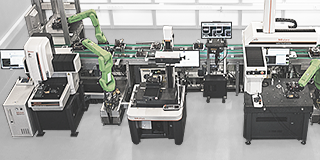 Manufacturing Automation Integration
Turn your factory into a smart factory with the help of Mitutoyo
 Mitutoyo Integrators
Integrating your measuring devices into existing processes made easy
 Repairs & Spare Parts
Spare parts and repairs for Mitutoyo devices
 Calibration
Get your measuring devices calibrated by a lab you trust
 Field Services
On-site service of your favorite measurement and testing machines
 Measurement Services
Get your workpieces and parts measured from anywhere in Europe
 Metrology and Product Training
The quickest way to get support or training
 Product Demos
Online or offline, get a product demonstration today
 IT Support
Perfect and hassle-free installation and integration into your IT infrastructure.
 Education Pack
Perfect for the workshop or classroom, there is no greater help than posters or learning material from Mitutoyo
 E-Learning
For those interested in metrology, Mitutoyo offers E-Learning courses to help train students, staff, or even hobbyists
 Online Material
If you're looking for a quick way to learn more about measurement, check out our many instructional videos
 Discover Mitutoyo
The world's biggest metrology company
 Career
Learn more about how it feels to work at Mitutoyo and the next steps toward starting your career here
 Merchandising
The popular destination for high-quality Mitutoyo apparel and more!


 Product Literature
View and download our catalog, product brochures, and more
 Software
Download our software and updates easily and conveniently
 Declarations of Conformity
Here you can download the full versions for the EU and the UK
 Free Wallpapers
Download official Mitutoyo wallpapers here for free
 Mitutoyo Brand Communication Materials
Resources for Mitutoyo staff and external suppliers
 Online Catalog
View our extensive product range in our online catalog!
-
Products
- Back Products
- Products
- Product Highlights
- Products by Industry
-
Small Tools
- Back Small Tools All Small Tools
- Calipers
-
Micrometers & Micrometer heads
- Back Micrometers & Micrometer heads Micrometers & Micrometer heads
- Digital & Mechanical Micrometers
- Micrometer Accessories
- Micrometer Heads
- Micrometer Head Accessories
-
Inside Measuring Instruments
- Back Inside Measuring Instruments Inside Measuring Instruments
- Inside Micrometers
- Bore Gauges
- Inside Micrometer & Bore Gauge Accessories
-
Depth Measuring Instruments
- Back Depth Measuring Instruments Depth Measuring Instruments
- Depth Micrometers
- Depth Calipers & Gauges
- Depth Caliper Accessories
- Height Gauges
- Indicators & Caliper Gauges
-
Auxiliary Equipment and Miscellaneous
- Back Auxiliary Equipment and Miscellaneous Auxiliary Equipment and Miscellaneous
- Indicator Satnds
- Precision Vices
- Plates and Granite Squares
- Angle Measurement and Squares
- Feeler Gauges, Rules, Knife Edges
-
Calibration Instruments
- Back Calibration Instruments Calibration Instruments
- Height Masters
- Check Masters
- Calibration Tools
- Gauge Blocks
-
CMM
- Back CMM All CMM
- Small & Medium sized CMMs
-
In-line & Shopfloor CMMs
- Back In-line & Shopfloor CMMs In-line & Shopfloor CMMs
- MACH Ko-ga-me
- MACH 3A 653
- MACH V 9106
- MiSTAR 555
-
Large sized CMMs
- Back Large sized CMMs Large sized CMMs
- STRATO Apex G
- CARB-Series
-
CMM Rotary Tables
- Back CMM Rotary Tables CMM Rotary Tables
- MRT240 Rotary Table
- MRT320 Rotary Table
- Probes
- Styli
- Fixtures
-
Enclosures
- Back Enclosures Enclosures
- CMM Enclosures
-
CMM Software
- Back CMM Software CMM Software
- MiCAT Planner
- MCOSMOS
- MAFIS Express
- MSURF
-
Vision
- Back Vision All Vision
-
Manual 2D Vision Systems
- Back Manual 2D Vision Systems Manual 2D Vision Systems
- Quick Image
- Quick Image Software
-
Manual 3D Vision Systems
- Back Manual 3D Vision Systems Manual 3D Vision Systems
- Manual Quick Scope
- Quick Scope Software
-
3D CNC Vision Systems
- Back 3D CNC Vision Systems 3D CNC Vision Systems
- Quick Vision ACTIVE
- Quick Vision APEX / HYPER
- Quick Vision ACCEL
- Quick Vision ULTRA
-
3D CNC Multi-sensor Vision Systems
- Back 3D CNC Multi-sensor Vision Systems 3D CNC Multi-sensor Vision Systems
- Quick Vision Hybrid
- Quick Vision WLI
-
MiSCAN Vision Systems
- Back MiSCAN Vision Systems MiSCAN Vision Systems
- MiSCAN APEX 404
- MiSCAN HYPER 302
- MiSCAN HYPER 404
-
3D CNC Micro Geometry Vision Systems
- Back 3D CNC Micro Geometry Vision Systems 3D CNC Micro Geometry Vision Systems
- UMAP Vision Systems
- UMAP Software
- Vision System Software
- Vision System Accessories
-
Optical
- Back Optical All Optical
-
Magnifiers
- Back Magnifiers Magnifiers
- Pocket Magnifiers
- Pocket Comparator
- Clear Loupes
-
Measuring Projectors
- Back Measuring Projectors Measuring Projectors
- PJ Series
- PV Series
- PH Series
- Data Processing Unit
- Edge Detection Sensor
- Accessories
- Measuring Microscopes
-
Microscope Units
- Back Microscope Units Microscope Units
- Microscope Unit FS70 Series
- Video Microscope Unit VMU Series
- Objective Lenses
- M2 for Measuring Microscopes and Projectors
- TAGLENS
- Illumination Units
-
Form
- Back Form All Form
- Surface Roughness
- Contour
- Surface Roughness & Contour
-
Form
- Back Form Form
- Roundtest
- Roundtracer
-
FMI Software
- Back FMI Software FMI Software
- Formtracepak
- Roundpak
-
Hardness
- Back Hardness All Hardness
- Portable Hardness Testers
- Combination Testers
-
Vickers Testers
- Back Vickers Testers Vickers Testers
- Vickers Hardness Testing Machine HV-110/120
- Automatic Vickers Testers
-
Micro-Vickers Testers
- Back Micro-Vickers Testers Micro-Vickers Testers
- Micro-Vickers Hardness Testing Machines HM-210/220
-
Hardness Testing Software
- Back Hardness Testing Software Hardness Testing Software
- AVPAK
-
Reference materials and indenters
- Back Reference materials and indenters Reference materials and indenters
- Hardness reference materials
- Hardness indenters and replacement balls
- Sensors
-
Digital Scales
- Back Digital Scales All Digital Scales
- DRO Linear Scales and Counters
- NC Linear Scales
-
Scale Units
- Back Scale Units Scale Units
- Horizontal ABSOLUTE Scale Coolant Proof IP66
- Horizontal ABSOLUTE Scale Standard
- Horizontal ABSOLUTE Scale Measurement Direction Switching
- Horizontal ABSOLUTE Scale Diameter Function
- Vertical ABSOLUTE Scale Standard
- Vertical ABSOLUTE Scale Measurement Direction Switching
- Vertical ABSOLUTE Scale Diameter Function
-
Data Management
- Back Data Management All Data Management
-
Data Management Software
- Back Data Management Software Data Management Software
- MeasurLink 10
- USB-ITPAK
-
Mini Processors
- Back Mini Processors Mini Processors
- Digimatic Mini Processor DP-1VA LOGGER
- Signal Cables
- Wireless Communication
- Interfaces
-
Timerbox, Digimatic Switch Box, Tolerance Box
- Back Timerbox, Digimatic Switch Box, Tolerance Box Timerbox, Digimatic Switch Box, Tolerance Box
- Digimatic Timerbox
- Digimatic Data Logger
- Digimatic Switch Box
- Digimatic Tolerance Box
-
Software
- Back Software All Software
-
CMM Software
- Back CMM Software CMM Software
- MiCAT Planner
- MCOSMOS
- MAFIS-Express
- MSURF
- Vision System Software
-
FMI Software
- Back FMI Software FMI Software
- Formtracepak
- Roundpak
- Hardness Testing Software
- Sensor Management Software
-
Data Management Software
- Back Data Management Software Data Management Software
- Measurlink 10
- USB-ITPAK
- Industries
-
Services
- Back Services
- Services
- Mitutoyo Japan Desk
-
Smart Factory Solutions
- Back Smart Factory Solutions
- Smart Factory Solutions
- Custom Products
- Manufacturing Automation Integration
- Mitutoyo Integrators
- Repairs & Spare Parts
- Calibration
- Field Services
- Measurement Services
- Metrology and Product Training
- Product Demos
- IT Support
-
Education
- Back Education
- Education
- Education Pack
- E-Learning
- Online Material
- About us
-
News
- Back News
- News
- Events
-
Special Promotions
- Back Special Promotions
- Special Promotions
- Press Area
- Downloads

Why may some Japanese speakers mistakenly refer to Mitutoyo as "Mitsutoyo"?
In this article, we will unravel the trivia surrounding this linguistic dilemma.
The origins of the Roman alphabet hold the key to the mystery
There are two types of romanization: the "Hepburn" system and the "Japanese" system.
Originally, romanization was invented by the Romans to write Latin in their own country, but in the late 1800s, efforts were made to spread this romanization to Japan. This resulted in the Hepburn system, which is based on English pronunciation, and in which the symbols "ツ" and "シ" are pronounced as "tsu" and "shi." Hepburn is the name of a person who was an advisor to the organization that was spreading the romanization.
Next is the Japanese style, which is the name given to a writing system devised by Japanese intellectuals in opposition to the Hepburn style. It was created by a Japanese person based on the Japanese 50 sounds, so "ツ" and "シ" were written as "tu" and "si". Incidentally, the Japanese style came to be called "くんれいしき" (Kunreishiki) after a cabinet order was issued in 1937 to unify the Hepburn and Japanese styles.
| Hepburn Style | Japanese Style | |
|---|---|---|
| つ | tsu | tu |
| し | shi | si |
| ち | chi | ti |
| じゃ | ja | zya |
References: Atsushi Kayashima (ed.) (2012) "New horizons in Japanese writing" Kuroshio Publishing
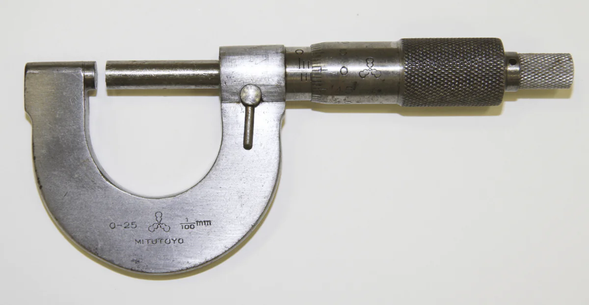
"MITUTOYO" engraved on the first domestically produced micrometer
Remnants of the Japanese style that have been used since the company's founding
Let's go back to the corporate logo. Mitutoyo succeeded in domestically producing micrometers in 1936. The company's products are stamped with the Japanese-style representation of the company name, "Mitutoyo". This was likely largely due to the growing movement in Japan at the time to support the Japanese style. After the end of the war in 1945, the Hepburn system became more common in Japan, but the "tsu" in Mitutoyo is still pronounced "tu" rather than "tsu" today, a vestige of that era.
Mitutoyo's iconic gourd mark
The first Mitutoyo trademark was a Japanese-style design mark with a gourd motif. It was devised in 1936 during the time of the Mitutoyo Manufacturing Company. Since the "Toyo" in Mitutoyo makes a Japanese person think of Toyotomi Hideyoshi, the motif was the Sennari gourd - Hideyoshi's horse crest.
Until the current corporate logo was decided upon as the sole trademark in 1987, this gourd mark (more precisely, a mark of three gourds surrounded by a circle) was used alongside the company's logo and is currently used as the company crest on the company building, flag, etc.
1936

1938
1960

1975

1987

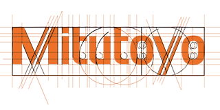
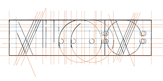
What about the lines in the "M" and "y" in our logo?
Finally, here's one more fun fact about our logo. Can you see that the "M" and "y" in "Mitutoyo" have an upward line in the upper right?
This line creates a sharp accent in the corporate logo and represents the high level of precision and technology that the company has as a manufacturer of precision measuring instruments.